
کاوه فردی - صفحه نخست


Old meets new.
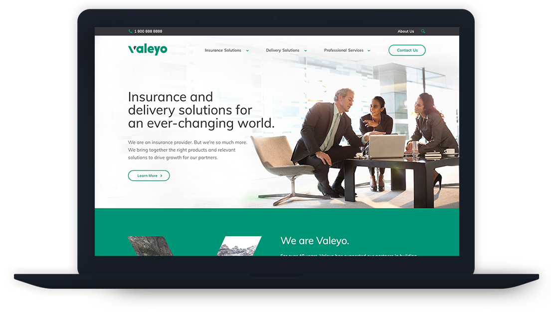
One of the oldest industries had to fuse with one of the newest when Valeyo (formerly CRI Canada) wanted to rebrand. Being a software company that provides digital solutions to insurance companies meant that striking that balance was critical. So we needed to get the imagery right. We couldn’t position the company as too technologically forward as we wouldn’t resonate with more traditional clients, but visual touches like parallax scrolling helped create a progressive look.
Making software make sense.
The offering that Valeyo brings has a number of angles and segments that needed to be organized in a way that made sense for their customers. A solid and intuitive navigation and easy-to-read page layouts helped to achieve this. Not to mention generate new leads as a result.


Fonts & Colours


